
Working through the Altenew Educator Certification Program, the directions for the Level 1 final challenge state I must choose any three of the lessons from the classes I have completed and create two card sets, one masculine and one feminine. I chose Easy Die Cutting Techniques, Let It Shine, and For the Guys. I also used techniques from the All About Layering modules.
Color Palettes for the Card Sets
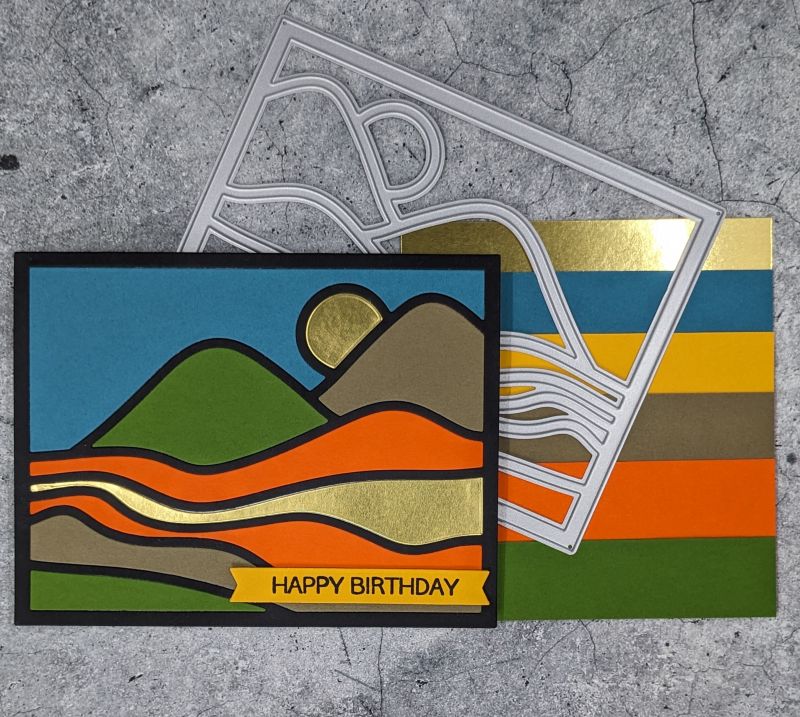
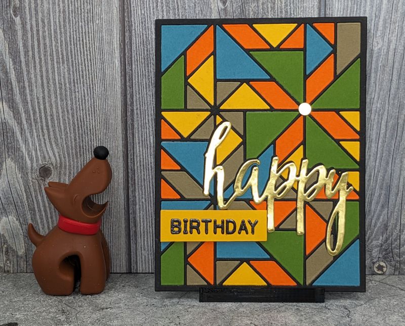
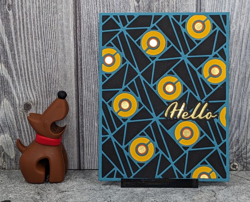
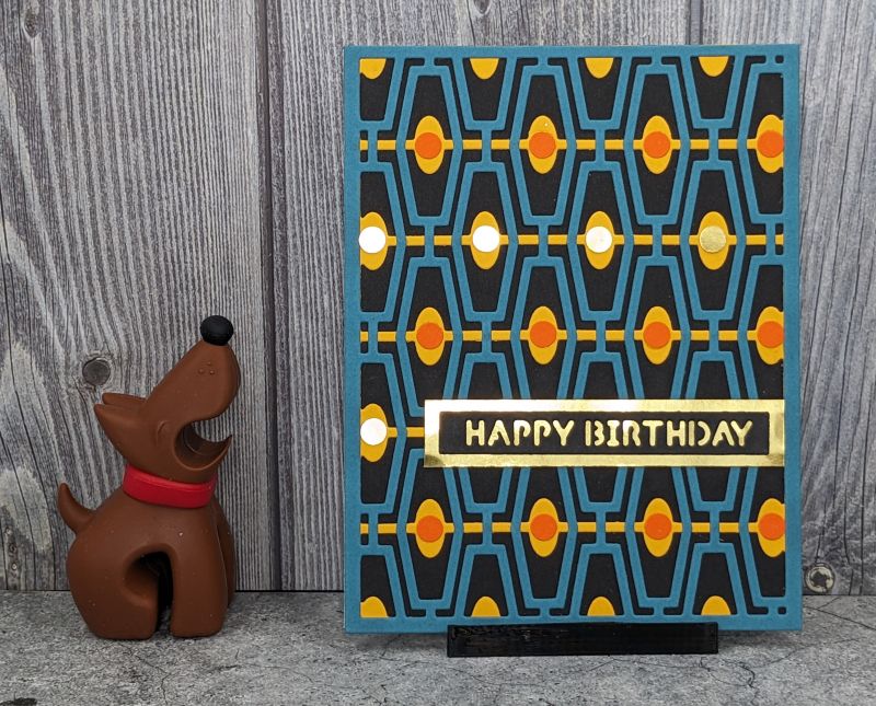
For my masculine set, I chose a color palette that is southwest inspired: teal, straw yellow, olive/brown, orange, and green. I see these colors when I look out my window every day! The feminine set consists of candy heart colors: bright pink, lilac, sea glass blue, light yellow, and salmon. Gold foil cardstock accents the masculine set, while Platinum Crisp Embossing Powder accents the feminine set.

Creating the Masculine Card Set
First, I worked through the masculine set, as I find these harder to create. The cards are a mix of Happy Birthday and Hello. Everyone needs an extra birthday card or two, and hello is useful for a variety of occasions. All the cards in this set have black cardstock as a base.


Inlaid Die Cuts
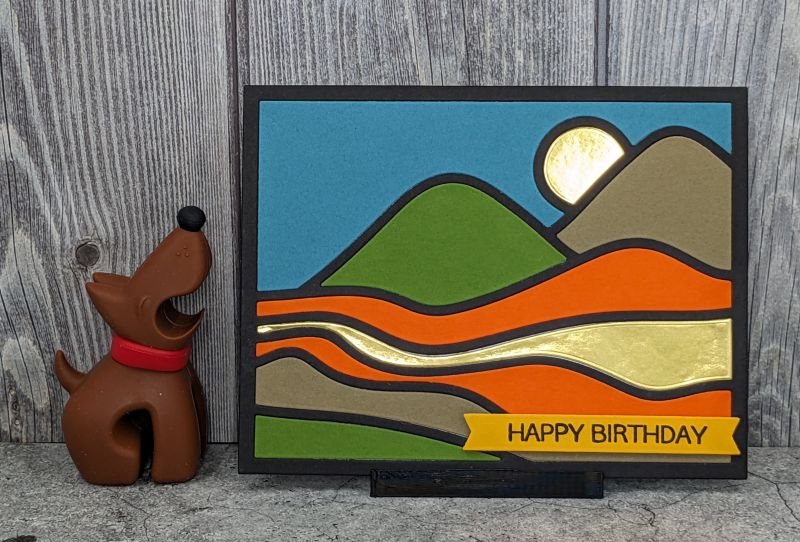
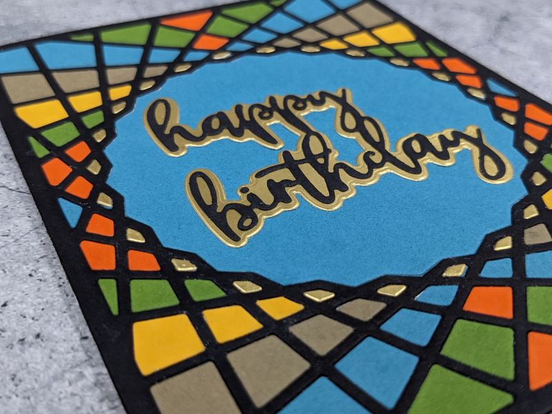
I used inlaid die cutting on four of the cards in this set. Inlaid die cuts are time consuming but pack a huge punch, especially with the gold accents against the black background. Glad Press ‘n Seal kept the pieces in order after I ran the dies through my Vagabond machine. Some of the dies are intricate and have very small pieces, like the Layered Geo Cover Die A. The Press ‘n Seal helped me not lose any. From there, I glued each piece in place. The happy birthday sentiment is the only part not inlaid. For just a tiny bit of dimension, I added it on top .
Layered Die Cuts
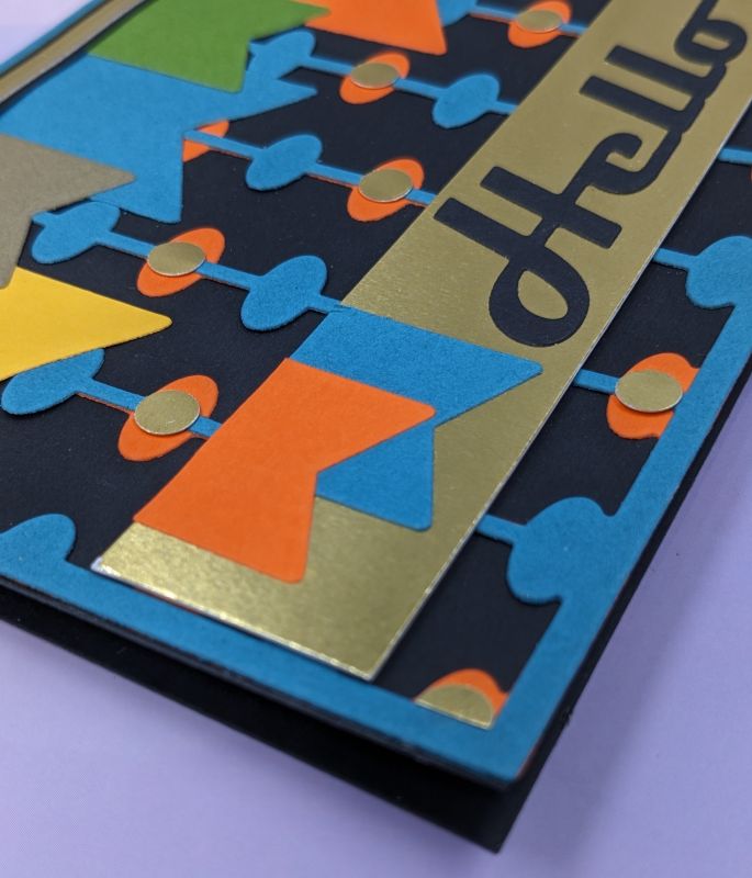
Moving along to the last two cards, I layered die cuts. The Abacus Cover Die layers perfectly behind the Mid-Century Modern Cover Die. Next, I layered the Happy Birthday from the Essential Sentiment Strips Die Set onto gold foil cardstock and adhered it to the front. Two layered Abacus Cover Die cuts form the bold Hello card. One of the die cuts is turned 180 degrees and layered behind the other.
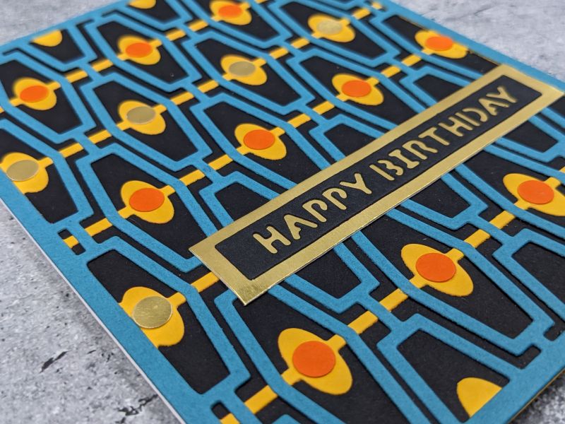
Strong geometric lines create the base of these cards. Another thing of note: only two of the cards contain any stamping. The mountainscape features Happy Birthday stamped on a strip, and the Simple Shapes Cover Die card has Birthday stamped and heat embossed in black on a strip. Both are popped up with pop dots. For many of the cards, I used a standard office hole punch to create accents.
Products Used for Masculine Cards
- Birthday Wish Die Set
- Layered Geo Cover Die A
- Geo Tiles Cover Die
- Simple Greetings Die Set
- Abacus Cover Die
- Mid-Century Cover Die
- Essential Sentiment Strips Die Set
- Simple Shapes Cover Die
- Happy Die
- Mega Greetings 2 Stamp Set
- Hole punch
- Black embossing powder
- Block Sentiments Die Set
- Bold Greetings Die Set
- Abstract Landscape Cover Die
- Sentiment Banners Cover Die
- Birthday Greetings Stamp Set
- Jet Black ink
- Embossing Ink
- Gold Foil cardstock
- Cardstock
- Buttons
- Ribbon
- Glue
- Hot Glue
- Tape Runner
- Pop dots
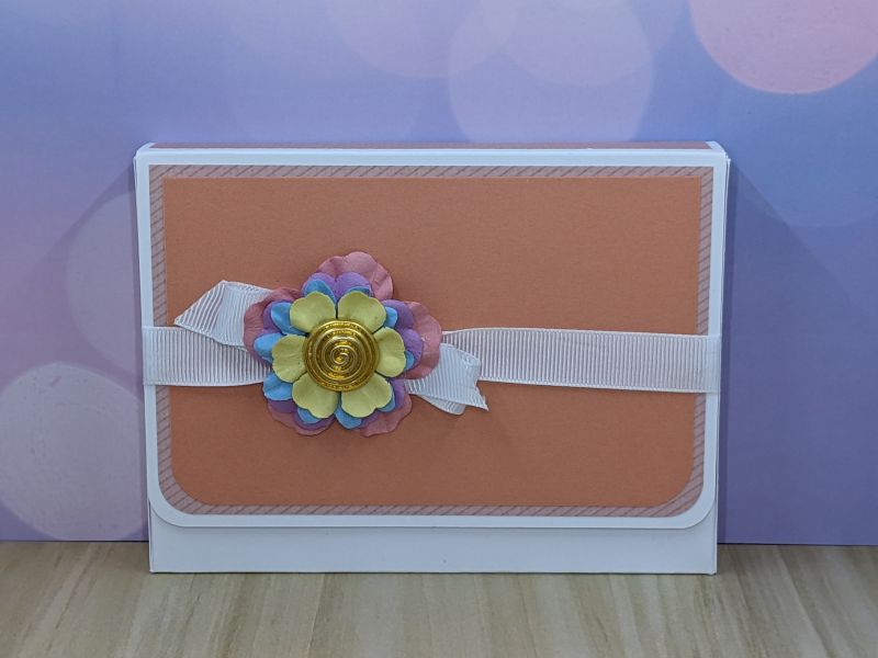
Creating the Packaging for the Card Sets
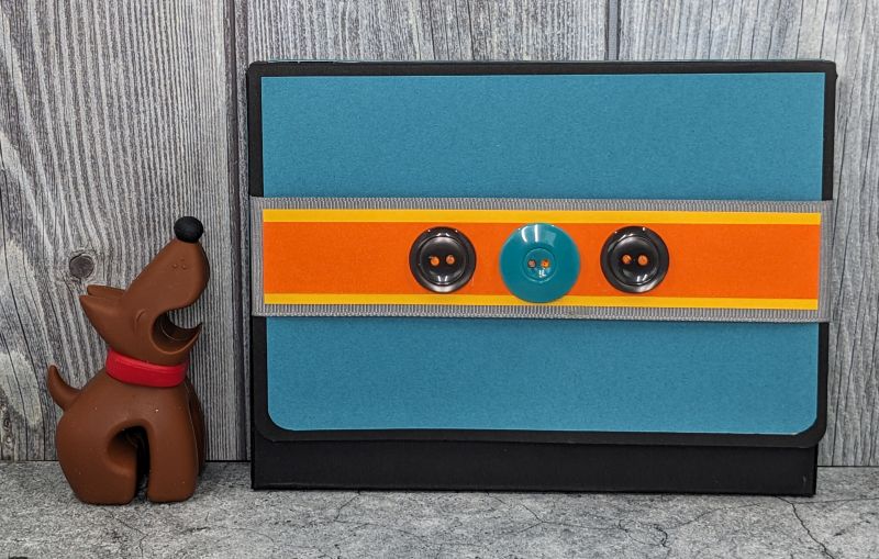
The instructions for this challenge require gift packaging for the card sets. The packaging must include a recycled element. A clutch-style box is quick and easy. I found the instructions at Vicki Wizniuk’s blog, Wizard’s Hangout, and crafted the masculine package from black cardstock. Then, accent papers from my southwest color palette layered over a gray grosgrain ribbon I had on hand from the packaging of a bedsheet set. Next, I hot glued three buttons I took from worn out clothing. Finally, velcro dots make a good fastener.
Creating the Feminine Card Set
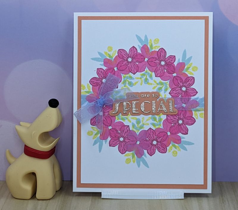
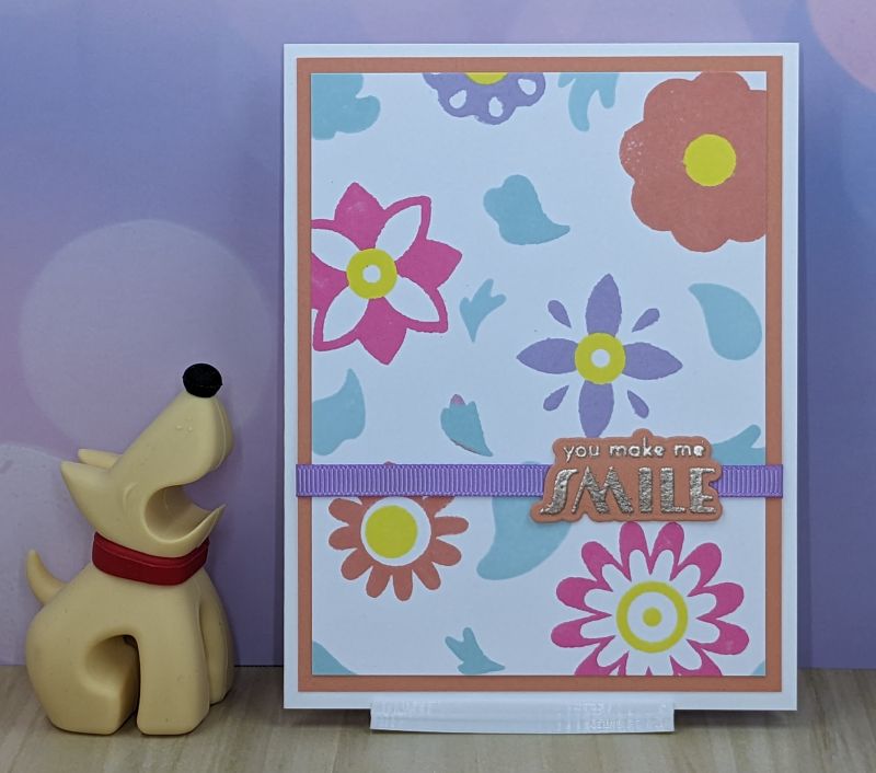
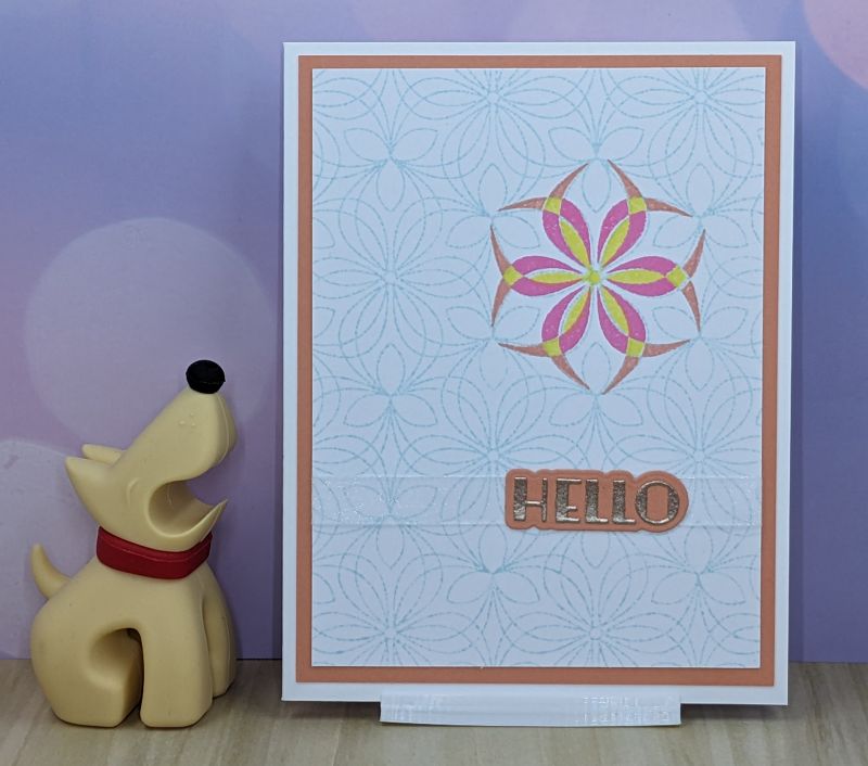
Moving along, geometrics and flowers together with the color palette scream feminine. Every card in this set combines stamping and die cutting and uses ribbon as accents. All of the sentiments are heat embossed with Platinum Crisp Embossing Powder and die cut. To further ensure the cards coordinate, all are layered onto salmon cardstock which is then layered onto a white card base.

Four of these cards feature large background stamps. Stamped, colored, and die cut elements form accents for three of the cards. I used layered stamping on the other three cards. Making the floral wreath card was super easy with Altenew’s Stampwheel. I cannot recommend it enough! It is so much easier to create the wreath with the Stampwheel than it is to do with the wreath templates out there.
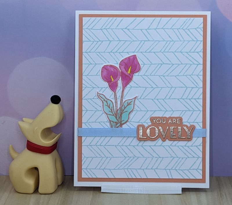
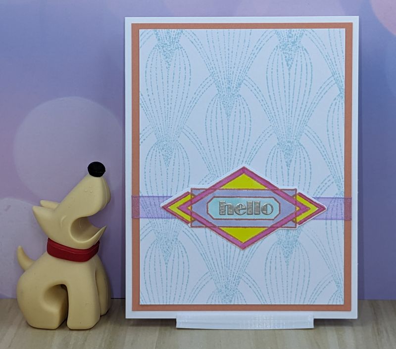

Of note on the You Are Lovely calla lily card, I only used three colors of Copic markers: Y04, BG10, and RV55. I accomplished the shading on the calla lily by going over the darker spots multiple times with the RV55 to create the darker shade.

Products Used for Feminine Cards
- Crisp Dye Inks: Sea Glass, Pinkalicious, Rouge, Citrus Burst, Wisteria
- Botanical Wreath Builder
- Geometric Botany Background Stamp Set
- Streamlined Outline Stamp Set
- Streamlined Die Set
- Deco Elements Layering Stamp Set
- Whimsical Herringbone Outline Stamp Set
- Mosaic Diamonds Background Stamp Set
- Groovy Garden Layering Stamp Set
- Circle Daisy Stamp and Die
- Mini Delight: Dainty Calla Lily Stamp and Die
- Platinum Crisp Embossing Powder
- Stampwheel
- Stampwheel Center Alignment Guides
- Copic Markers: R02, RV55, V22, Y04, BG10
- Cardstock
- Ribbon
- Button
- Silk Flowers
- Hot Glue
- Glue
- Tape Runner
Feminine Packaging
I used the same template from Wizard’s Hangout to create the packaging for this set. White cardstock layered with salmon-colored papers makes the base. White grosgrain ribbon upcycled from a dish towel set forms a point for accents. A few silk flowers nestled in the center of the bow and a button from an old coat hot glued on top completes the look. This time, I used hidden magnets for the closure. I found I prefer the magnets to velcro. The magnets hold the clutch closed, but have the perfect amount of give when you open it. The velcro takes a bit more force and it would be easy to bend the cardstock in the process.
What I Learned
Altenew’s line of products are well-designed and easy to use, especially the Stampwheel. I love the ease of creating a wreath or circular design, and the tacky mat is fantastic for holding your paper in place while you stamp.
As I worked through the lessons, I tried techniques that I have not used very often – or at all – in the past. I had given up on layering stamps until I found Altenew. Their clear instructions in every package and thoughtful stamp design makes layering stamps easy – something I never associated with layering stamps in the past. I’ve found what is easiest for me in terms of stamping order. For instance, I prefer stamping the outline before filling in with the detail layers. That is freeing!
Adding embellishments to projects can be as simple as substituting gold foil paper for some other color of cardstock. I was pleasantly surprised at what a difference that small change made on the masculine cards. Using small pops of the gold foil cardstock on the inlaid die cut projects really draws your eye.
The biggest lesson I learned throughout the Level 1 courses is to let go of preconceived notions. Use colors that you normally wouldn’t. Combine techniques. Try something new. Do not be afraid of bold colors and textures.